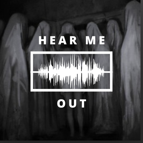
Me and my team have come upon this thumbnail from a playlist on Spotify and we were inspire to do the same thing but with a twist of our own idea. We have decided to put me and my team as the ghost fabric and our guest as the kid in the middle.
Our podcast member as the ghost and our guest star were in the middle and we wanted to surround the guest star. But it was quite unfortunate that we couldn't do it due to the 1 week holiday for G20 and my friend being sick and having to attend a basketball match, so we changed it to something simple.
We made our thumbnail and logo separately. At first I was looking at an image and I found a good image that is related to our podcast and added text in the middle. For our logo we used a picture we took from spotify and again added a text over it.
I thought it was not good enough for our thumbnail and thought of changing it. I thought about having a skull for our logo, then out of nowhere I thought of this cartoon that I used to watch which is word world where things are made of the word itself.
Then I search for a skull image where I can trace it and make a base out of it. At first I drew a sketch out of it, then asked a few friends of mine who are in the unsolved podcast (kanna and erina)
then I finally finalised the work and started to work on it. This was the first result. I asked my friend again what they thought of it and made a few changes according to them. Then dyfan ( who is one of the member crew of hear me out) asked me to put a shade on it and change the background colour.
Then I thought it would be better if I put the logo on top of the ghost picture and add some effect to it. That is our final result for our logo. For the thumbnail we decided to make a hand out of it to make a mystery aura out of it and change the title every time a new episode comes out.


Comments
Post a Comment